The very first step to think in probabilities is accepting that there exists a “level of confidence”. Not just things that you know and things that you don’t, but also many more options in between. It then becomes relatively easy to perform pairwise comparisons, such as “I am more confident in answer A than in answer B”. Sure, but how much more confident ? That’s the difficult part. In this post, we are interested in the process of calibration, assigning precise numbers to our confidence such that out of all guesses for which we state 80% confidence, exactly 80% are correct. But first, we must dig into what to expect regarding scores of these estimations, to understand why high scores do not imply high calibration.
This post uses real quizz data from a hands-on experiment about improving calibration, and will reveal answers to some questions in this quizz. If you wish to take part in the experiment before reading, complete the quizz “Capital cities of Europe” on prediction.robindar.com. All answers presented here are anonymized and shared with permission of participants.
Analyzing scores
The following figure shows the score of 8 users on a 10-question geography quizz about the capitals of Europe. Each question uses the decimal logarithmic score \(S(q,k) = \log_{10}(q_k)\). This means the score for each question is always negative, with the best score being zero (probability one predicted for the correct answer). For comparison, a reference score is given for each question, defined for a question with \(n\) answers as \(- \log_{10}(n)\), which is the score of an evenly-spread probability (i.e. \(1/n\) probability for each answer).
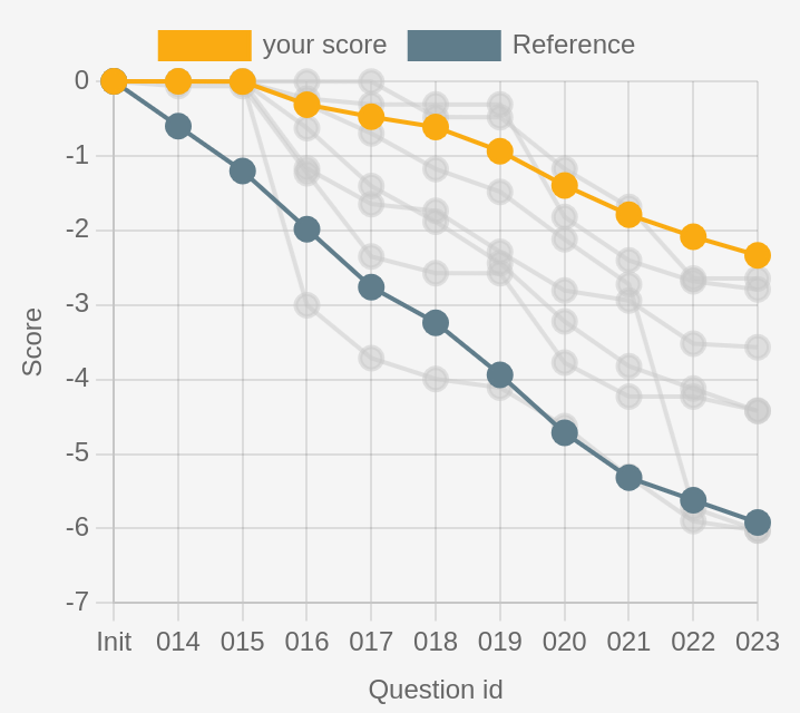
Figure 1 shows the data you would receive after participating in the quizz, with your score highlighted in yellow, the reference curve for comparison, and a sample of a few trajectories to compare against other humans. See how some curves are initially above the yellow line, indicating better performance, and later end up below the yellow line, due to lower scores on the later questions. There is also a grey line doing essentially no better than the reference.
Advanced. Notice the easy questions (Q14 and Q15) have all humans scores at zero: those are the easy warmup questions. Observe how on the contrary some questions cause large drops (Q16 and Q22), most likely because of misconceptions (or hardness in expressing credences with tiny sliders, this is also significant for first-time users). The high slope of lines compared to the reference slope indicates a score significantly worse than the reference, i.e. users who would have gotten a better score if they just answered that they didn’t know.
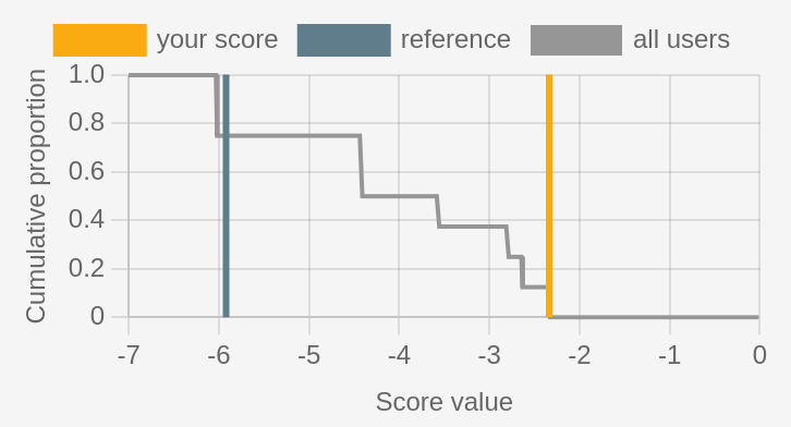
Final scores. Rather than checking cumulative score after each question, we can simply look at the final score numerically, presented as a cumulative distribution in Figure 2. The reference score is (-5.9) and the yellow user’s score is (-2.3), which is the best of this group. A more positive way to express this score is as the number of points above reference, or here (R+3.6). We can see here that a score or (-4) would place a user in the top 50% of scores, and an improved score of (-3) would jump to the top 40%. Note how about 20% of users have a score very close to the reference.
Detailled analysis. If we were in an examiner’s position, trying to understand the level of comprehension of a class tested with this quizz, we would instead like to look into the scores for each question, to assess what topics are understood and which are more uncertain.
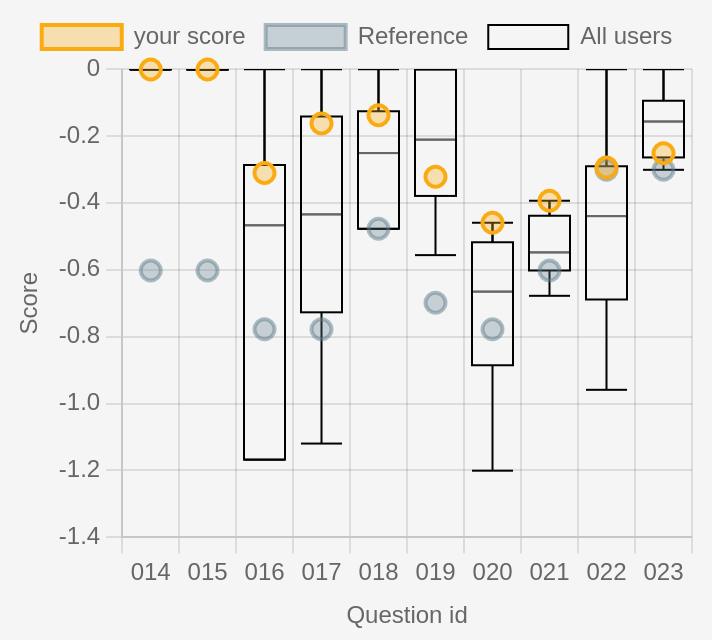
Figure 3 shows boxplots (median, quartiles and max/min) of the scores for each question. As expected from previous observations, Q14 and Q15 have all humans answering correctly, with a reference score of (-0.6) because there were four possible answers. The questions are about the capital city of Belgium and Spain, understandably easy. On the other hand, Q16 is about the capital of Switzerland (Bern, but often confused with Luzern, Geneva, or Zurich) and indeed shows more than 25% of users below the reference. The corresponding reference score of (-0.8) indicates that there were 6 possible answers.
Advanced. Only two questions have no perfect answers: Q20 and Q21, which are about population of major cities and in scandinavian capitals. One question does have a perfect answer from one user, but 75% of answers below reference (Q22). The question Q22 is about which of Berlin and London is furthest north, which is understandably hard and explains the low scores, although at least one user is not fooled. We can easily guess how this information could be used to guide later classes if this had been a quizz at the end of a geography class.
Answer patterns. Even on questions with typically-distributed scores, we can learn a lot from looking at individual probabilities selected. In Figure 4, we see a superposition of answers to a question about which of these cities in the Baltic States is the capital of Estonia.
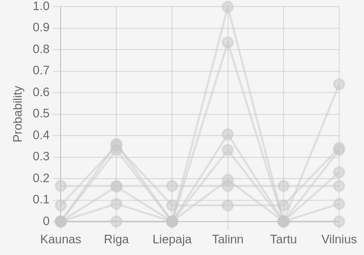
There are some very flat answers at 17% for each of the six answers, but we can still see a lot of weight is placed on Riga (capital of Latvia), Tallinn (capital of Estonia) and Vilnius (Capital of Lithuania). Several users with moderately-high score have correctly identified the three capitals of the Baltic States, but remain confused about which capital corresponds to which country. We can also see the confidently-correct answer getting the highest score of zero.
Calibration of credence estimations
Playing around with quizzes like this one will quickly get you to intuitively improve your score by placing more weight on answers about which you are very sure, and more evenly-spread probabilities when you are unsure, just by getting a good intuition for it as a game.
But there is more to probabilistic question-answering than the score. The probabilities, individually and numerically, can have meaning. Placing 20% credence on an answer is not just a good balance between enough weight and not too much, it can really mean something distinct that is above 15% and below 25%. This idea is captured by the concept of calibration.
Step 1: Under true randomness
To understand a little more intuitively the concept of calibration, it is easier to start with an inherently random process, for which assigning probabilities is less counter-intuitive. Let’s consider the following setting. I shuffle a deck of cards, and assure you that every card is either black or red, but without revealing the proportion of each. I draw and show you ten cards, then ask you to predict the color of the next card (as a probability of drawing black). Then I draw the card, write down the outcome, discard the deck, and start over with a new deck.
Let’s assume that you always predict a percentage that is a multiple of ten, between 10% and 90%. To evaluate your performance at the end of the game, I group all the rounds for wich you answered 10% probability of the card being black, and count how many of those came out black or red. Note that this has nothing to do with the true proportion of black cards in the deck, maybe one of the decks had 90% red cards and I happened to draw a black card and another had 50% of each and I drew a red one. The proportion of black cards we would observe in this two-deck scenario is 50% (one black in the first round, out of two decks). Each category only corresponds to the proportion you predicted. Here’s a plot of the calibration curves of several players.

The grey reference line shows what a perfect calibration curve would look like. None of our players is very well calibrated, but they have interestingly different behaviors.
First, Arthur is consistently underestimating the probability of seeing a black card. For instance, if you do not see the first ten revealed cards but hear Arthur say that he thinks there is a 40% chance of drawing a black card next, then based on this curve, you best bet is to predict a 70% chance of observing a black card, much higher than Arthur’s estimate. Similarly, Beatrice seems to overestimate the proportion of black cards, though by a smaller margin than Arthur’s guesses.
Charles is making a different kind of mistake: overly extreme predictions. When he predicts a (relatively low) 20% probability of drawing a black card, we actually observe nearly 50% of black cards. But when he predicts a (high) 80% probability of drawing a black card, we observe only around 65% of black cards.
Seeing how often we observe 60% of black cards, it is possible that most decks presented to Charles had roughly 60% of black cards (reminder: this is not surprising, there is no reason whatsoever to assume that the decks will have varying proportions of each color, nor that they will have on average half of each color). One possible explanation for this result is that Charles tried to predict values too extreme despite the decks all having very similar proportions of each color.
Step 2: Calibration under uncertainty
In the previous example with a random process having a well-defined probability of drawing black or red at each round (each deck has a well-defined proportion of black cards), it was easy to see why we would like our predictions to align exactly with this true probability.
When the probabilistic answer is meant to represent uncertainty, rather than a true underlying randomness, the concept of calibration is exactly identical. Among answers for which a 20% probability of being correct was selected, we would like to observe about 20% of correct answers.
Confidence intervals for calibration
Instead of plotting the exact proportion of correct answers in each group, which tends to lead to calibration curves that are much less smooth that the ones presented in Figure 5, we can resort to confidence intervals which tend to give smoother pictures.
In Figure 6, we see the estimated calibration of a single user answering various quizzes such as the one studied above. We can tell with 99% confidence that among answers where the user placed 20%-30% credence, there are about 0%-50% of correct answers in general. This is a very large window, but we can only give a smaller estimate with lower confidence. For instance with only 50% confidence, we can estimate that 0%-10% of those answers are correct in general, but there is a non-negligible chance that we are mistaken in this more precise analysis.
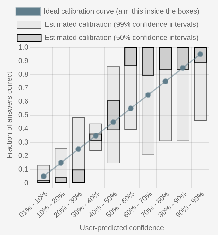
Despite the higher uncertainty that is necessary when dealing with real data, we can start to tell that this user has the opposite problem of Charles above: they are giving credences which are not extreme enough, with nearly-all of their 50%-60% credence answers being correct. This means they should have reported nearly 90% credence instead of 60. We can also observe a particularly good calibration around 30%-40%, which is likely explained by the fact that most of the questions have two to four answers, so evenly-spread credences contribute to this high calibration.
Conclusion
We have seen with several examples how to interpret the scores of a group of participants to a probabilistic quizz, and how to compare the score of a single participant to the group and to a reference. This is enlightening as a form of measure of the comprehension of a group, but it is also a good tool to improve our own estimates of our credence by practicing on several quizzes and reviewing the resulting scores. We have also seen how to measure calibration and how to interpret the shape of various calibration curves. This should be more than enough for you to improve your estimations of confidence by simply practicing it over time. Good luck on your journey!